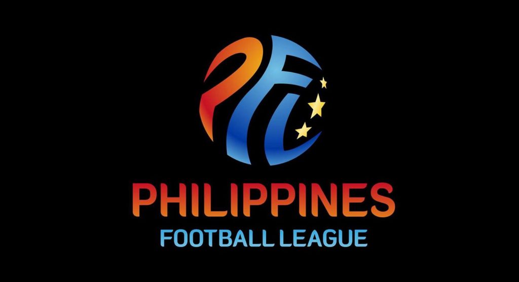
Your thoughts on the name and logo of Philippines Football League?
Practically, every Filipino football fans, at least those who are aware of the latest update, are excited of the newest full professional football league in the country – the Philippines Football League.
The internet forums is abuzz with talks about the activities that took place the previous day. Mostly the subject was about their favorite football clubs, but two particular topics that caught my attention – the logo and name of the league itself, specifically the first word – “Philippines”.
The logo
I personally like the logo, it looks world class. It’s not the usual shield background that most football clubs around world incorporated it in their emblems. Although, most football league logos don’t use the shield element.
Another thing I took notice of, is the absence of the soccer ball icon. This is a good deviation, design-wise. The ball is a common element among football league logos.
A number of fans like the PFL logo as well, a positive sign as many of us Filipinos are pessimistic in practically every subject. We are just hard to please.
Now about the name.
The name
The name gets mixed reactions from fans, specifically about the presence of “s” in the Philippines. A fan started a topic solely about the s in the Philippines with a hashtag #ParangMayMali. Even giving examples of other existing companies like Philippine Airlines which does not use the “s”.
In my opinion, there is no error of any sort, be it grammar or whatever.
But I can sense that in future PFL-related news, some sports journalist would write “Philippine Football League”. Yes, without the “s”.
Well, with “s” or without, what’s more essential is Philippine football becomes number one.
So, what’s your take on this?


